Box
Divi-Modules – Image Box loads your image into an image box. You set the box size, then scale, crop, rotate and flip the image within. There are separate settings for desktop, tablet, and phone. So, your landscape image on desktop could be square on tablet and portrait on mobile.
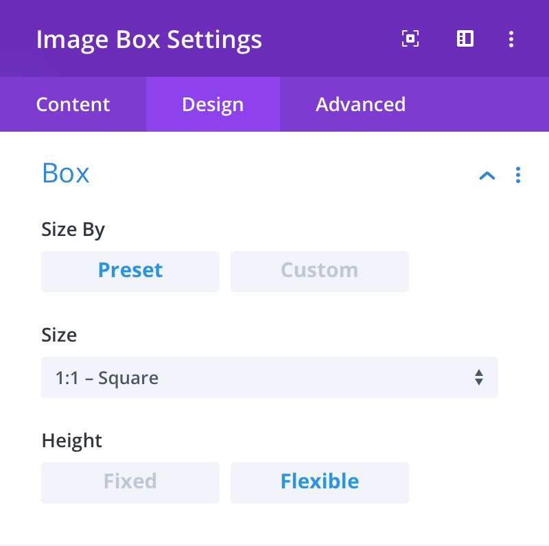
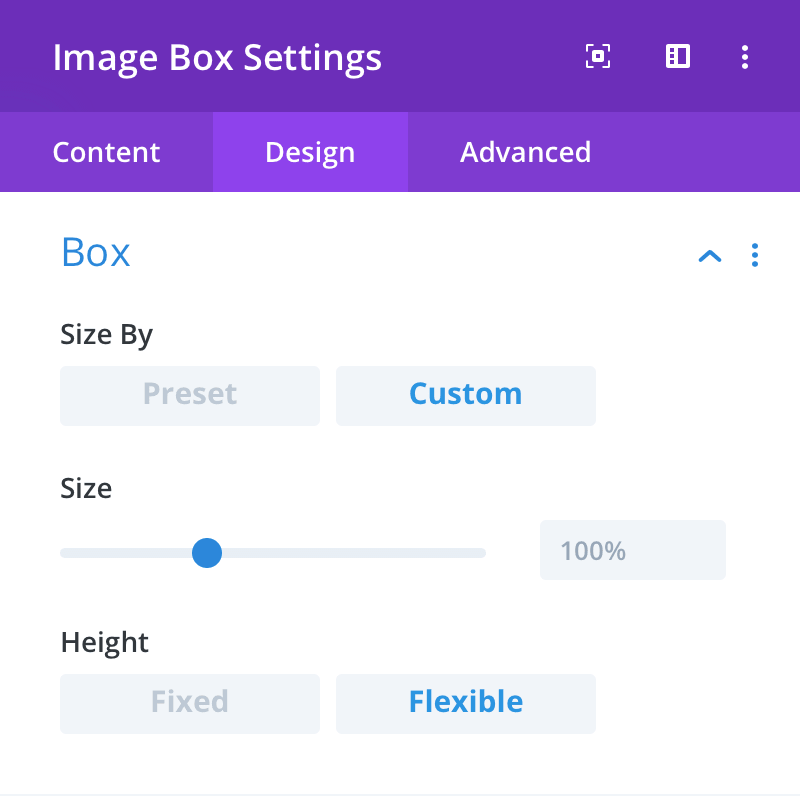
Size By
Here you can choose to set a preset or custom size for the image box.
Size (Preset)
Here you can choose a preset size for the image box.
Size (Custom)
Here you can set a custom size for the image box. The percentage value represents the image box height as a proportion of its width.
Example: 100% will make a square, while 50% will make an image box with a height that is half that of its width.
Height
Here you can set whether the image box height is fixed or flexible. When Fixed is selected, the height of the image box will be determined by the Size setting. When Flexible is selected, the height of the image box will increase as necessary to match the height of the text area.
Note: The effect of this setting can only be seen when the text area is positioned to the left or right of the image and is also larger than the height of the image.