Divi 5
OUT SOON
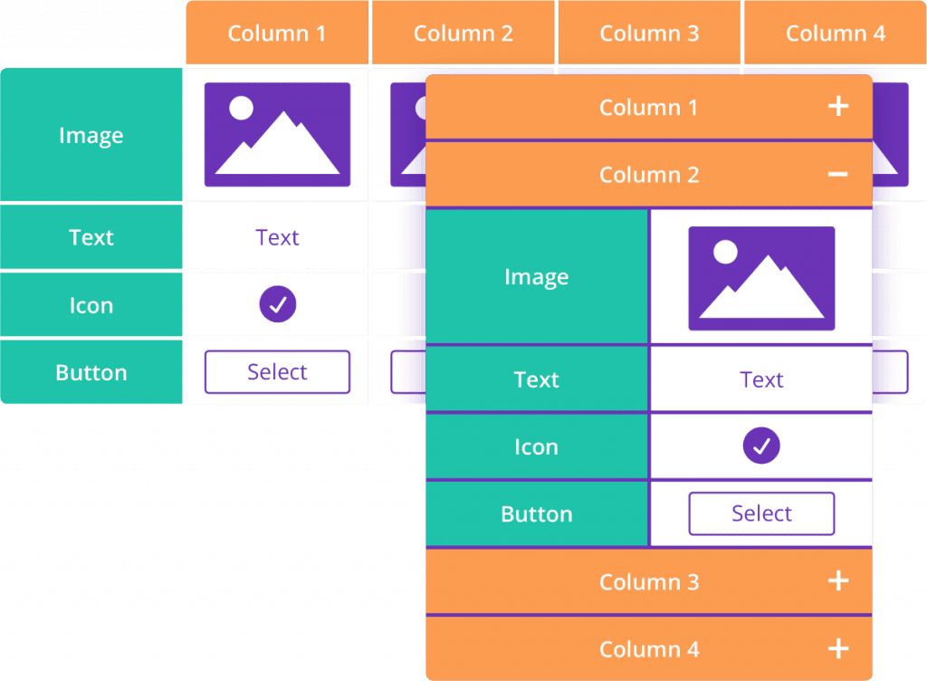
Table Maker TOP SELLER
Divi-Modules – Table Maker brings beautiful responsive tables to the Divi-Builder. With features including…
- Multiple headers and footers
- Column and row spanning
- Icon, button and image cells
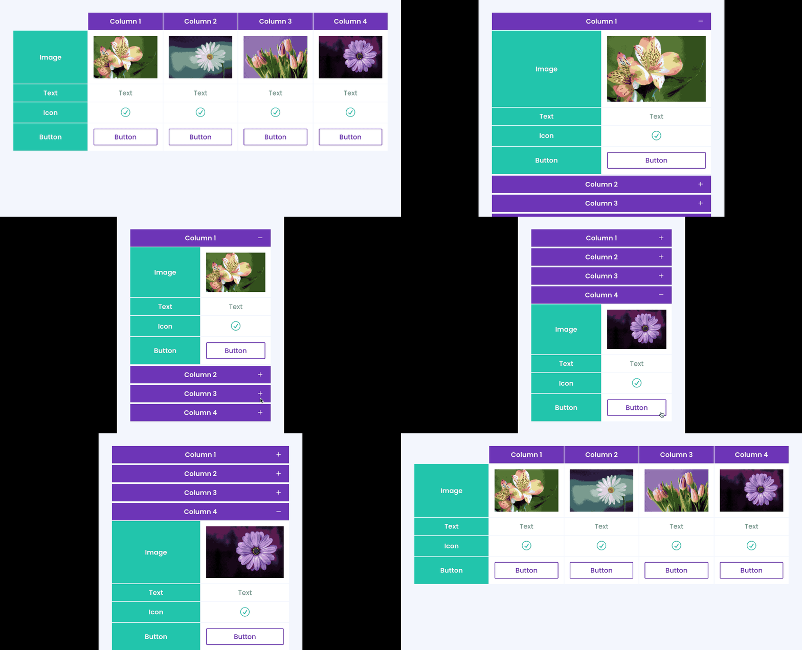
- Accordion view for mobile
- Scrolling with sticky headers
- and much more…
- Requires Divi, Extra, or other Divi Builder theme.
- Requires CSS Grid in-browser support.
- Not yet compatible with Divi 5. Find Out More
Divi-Modules – Table Maker brings the convenience of responsive tables directly to the Divi builder – without the need for third-party plugins and shortcodes. Style every part of the table from content to columns, headers to footers, right down to individual cells.
Features Include
Multiple Headers and Footers; Column and Row Spanning; Icon, Button and Image Cells; Accordion view for mobile; Scrolling with Sticky Headers; and more.
NEW!
Title & Description
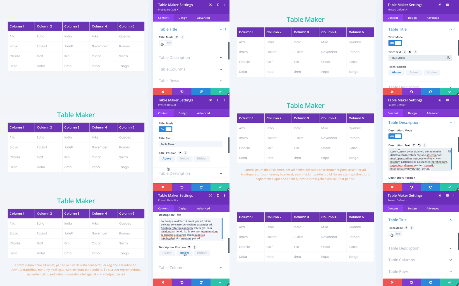
Tables can include a title and description which can be positioned above or below the table, or hidden so that they are visible to screen readers only.
Table Columns & Rows
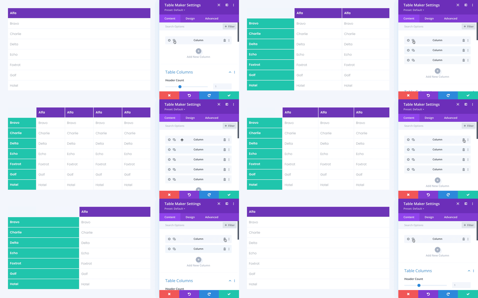
Tables can include as many columns and rows as you need.
Table Headers & Footers
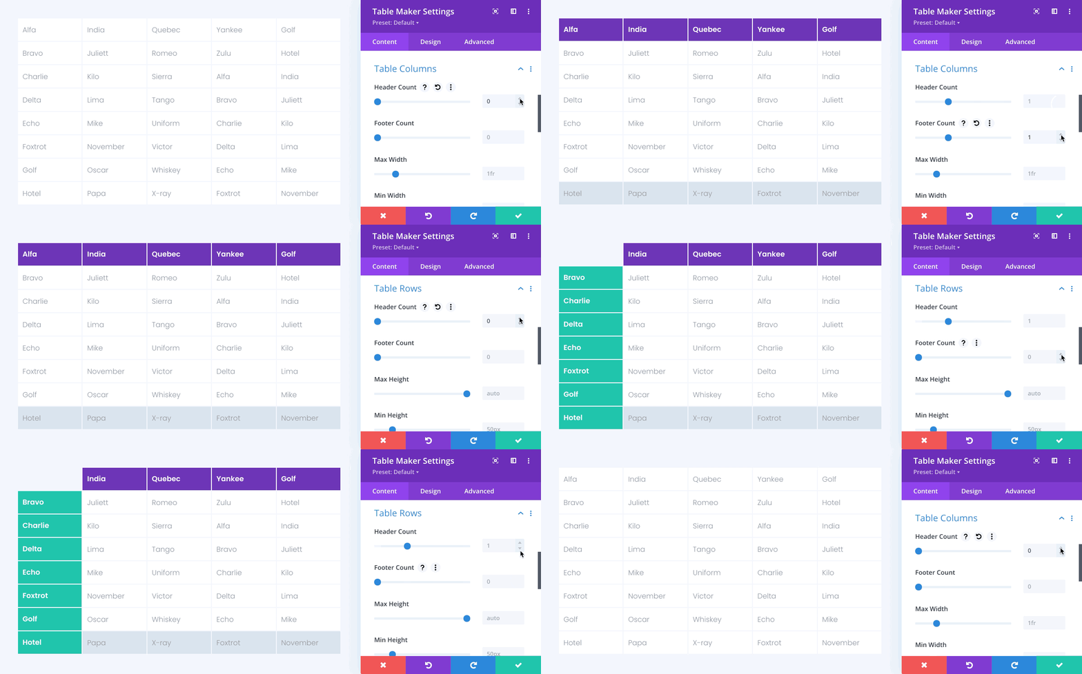
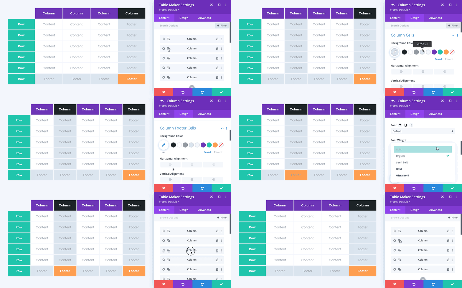
Tables can include any combination of table content, column headers, column footers, row headers, and row footers.
NEW!
Table Corners
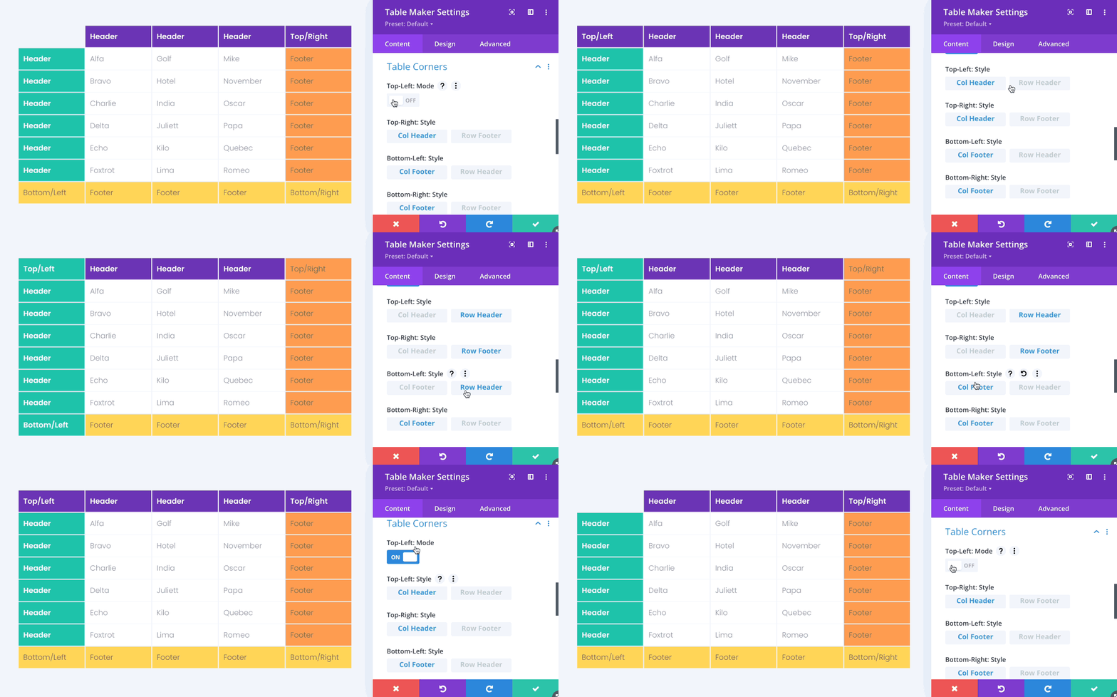
Corner options allow you to hide or show the table’s top-left corner cells and select whether corners are styled as headers or footers.
Table Width & Height
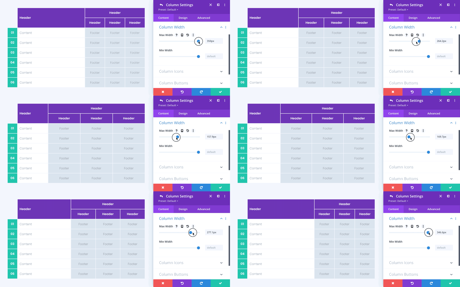
Column widths and row heights can be set using a combination of flexible and fixed units.
Table Scrolling
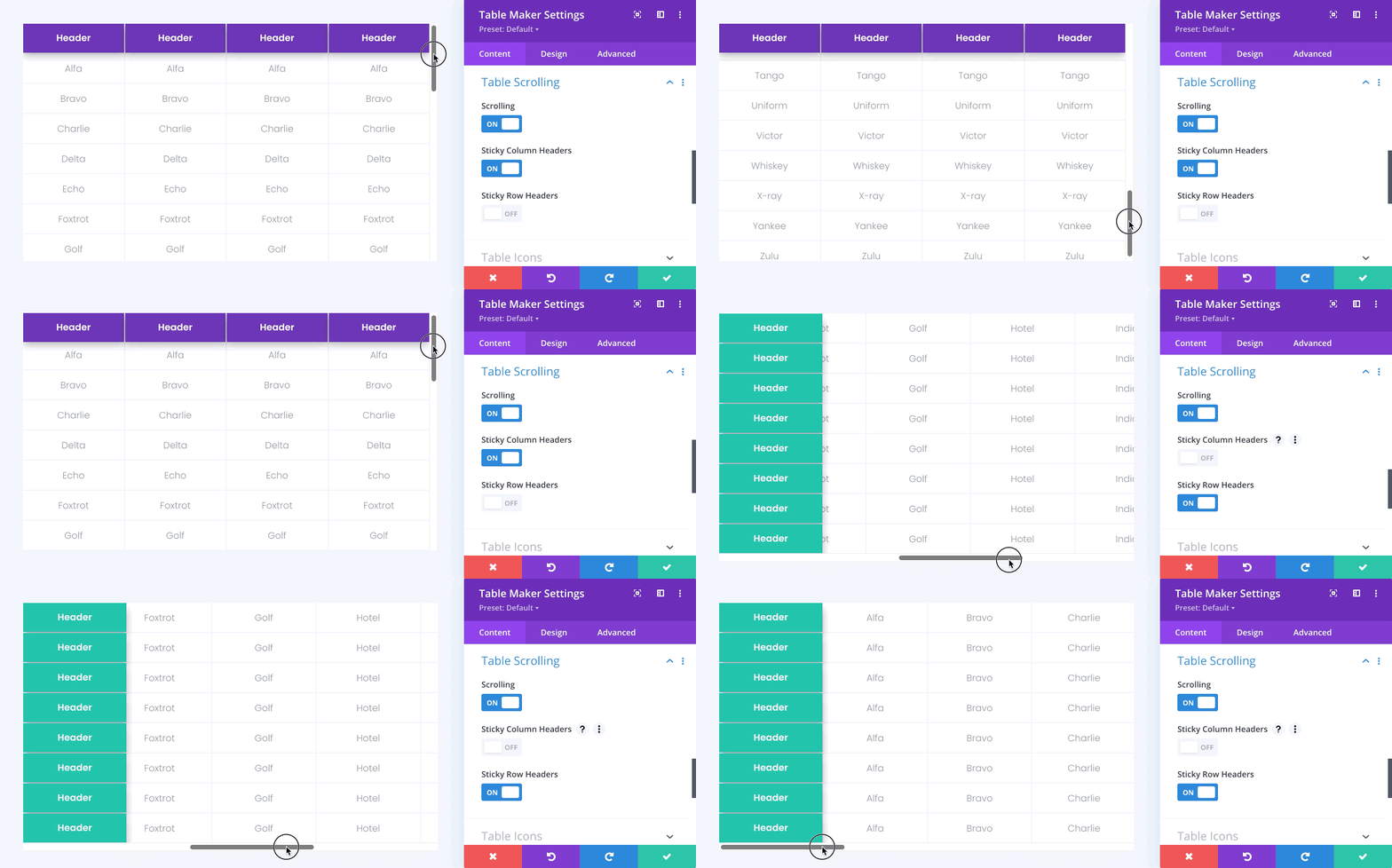
Tables can be set to scroll, with optional sticky column and row headers to keep headers pinned to the edge and visible at all times.
Table Responsive
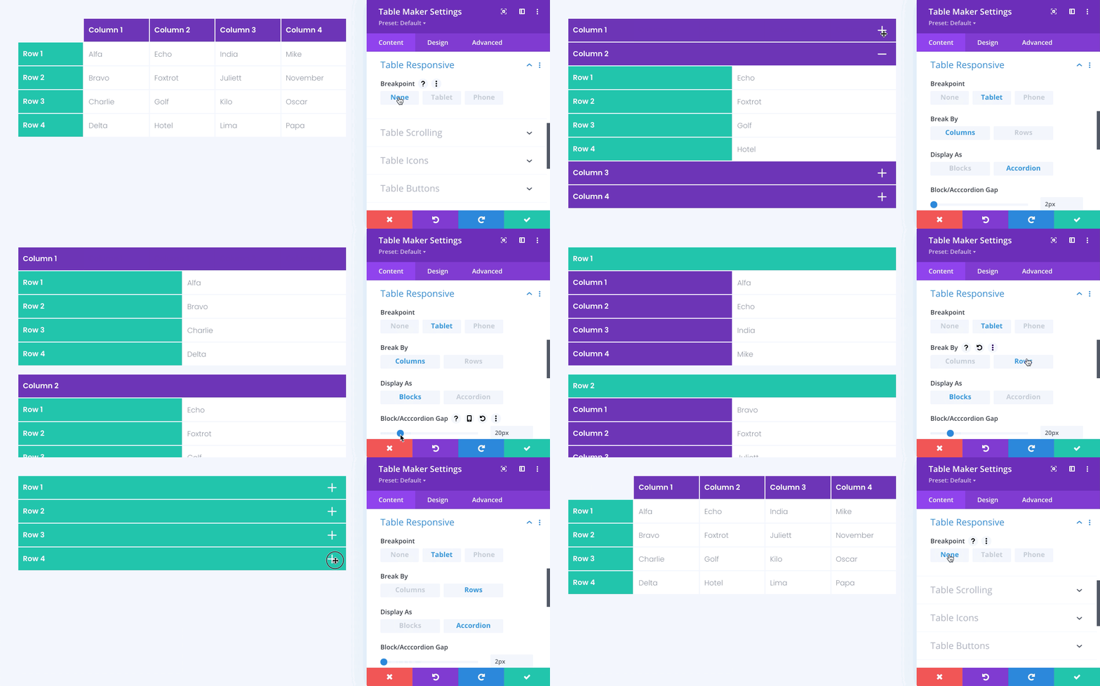
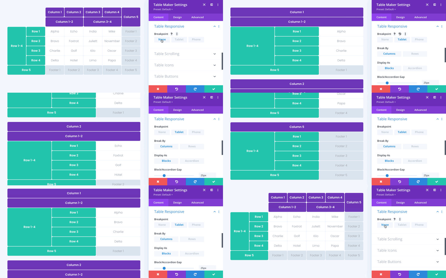
Tables can be set to display as blocks or accordion at tablet and phone size, with the option of breaking the table by columns or by rows.
Table Spanning
Table cells can be set to span across multiple columns and rows. Even complex table configurations, like the one below, still work beautifully at tablet and phone size.
Table Content
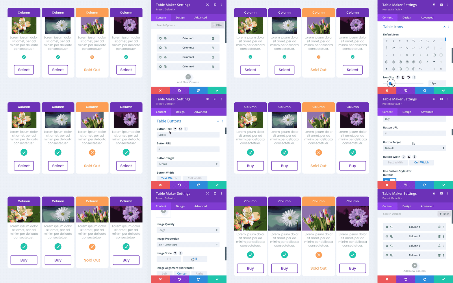
Table content can include text, icons, buttons and images. For a complete list of available icons, please see here.
Table Frame
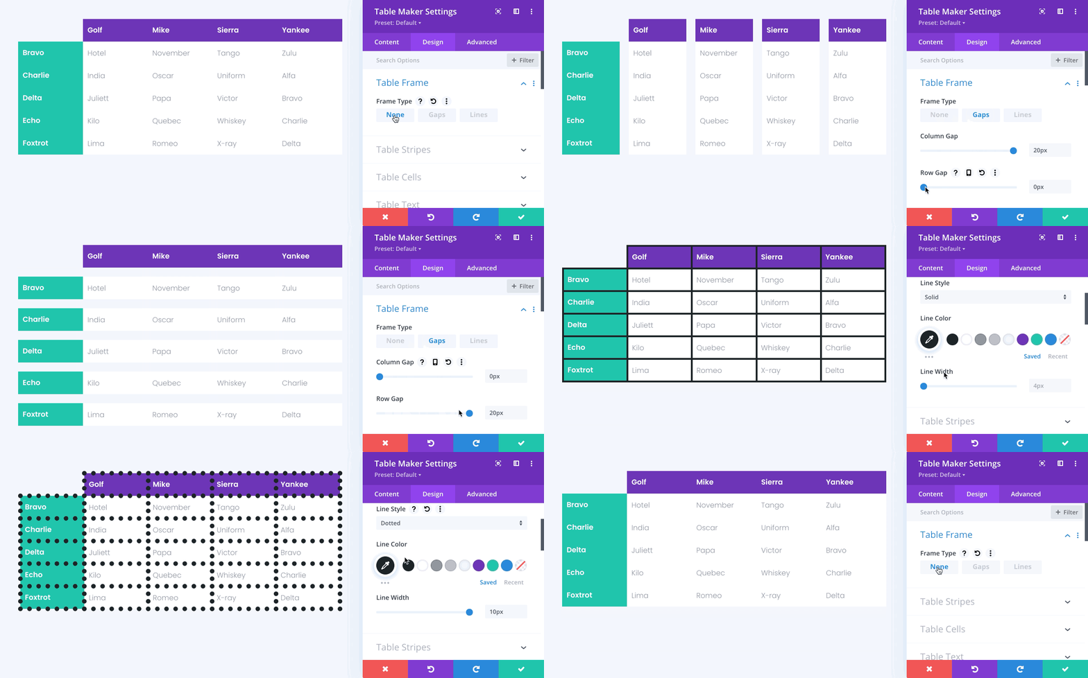
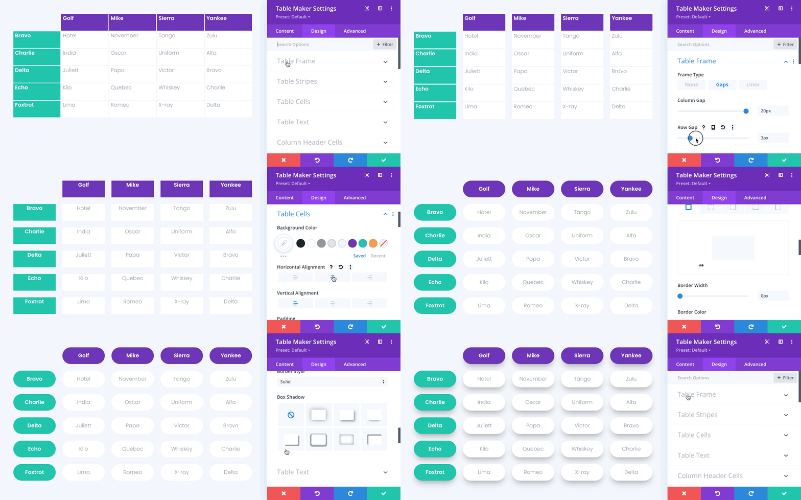
Tables can be framed with gaps or lines. Gaps put a space between each table cell, allowing backgrounds to show through. Lines frame each cell with a solid or decorative border.
NEW!
Table Stripes
Tables can include horizontal or vertical stripes which can be a tint, blend, or pure color. Stripes can be odd or even and can be separately applied to table content, headers and footers.
NEW!
Table Hover
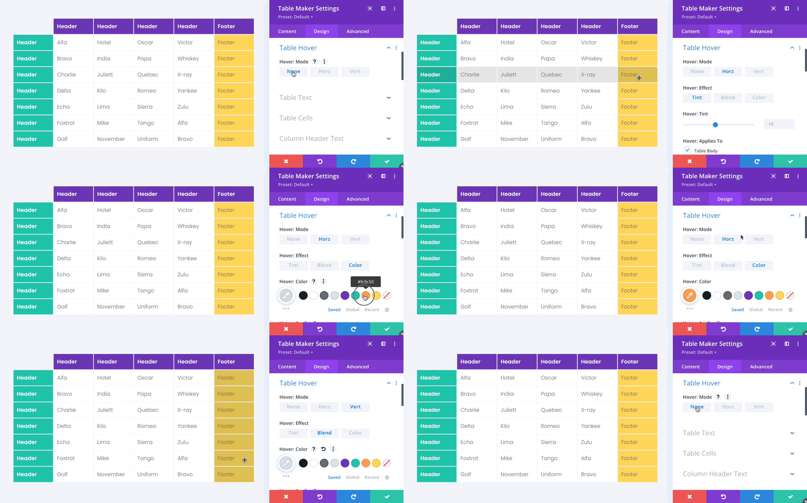
Tables can include a horizontal or vertical hover effect which can be a tint, blend, or pure color. The hover effect can be separately applied to table content, headers and footers.
Table Colors
There are separate color options for table content, column headers, column footers, row headers, and row footers. Styles can be applied table-wide, per column, or individual cell.
Table Text
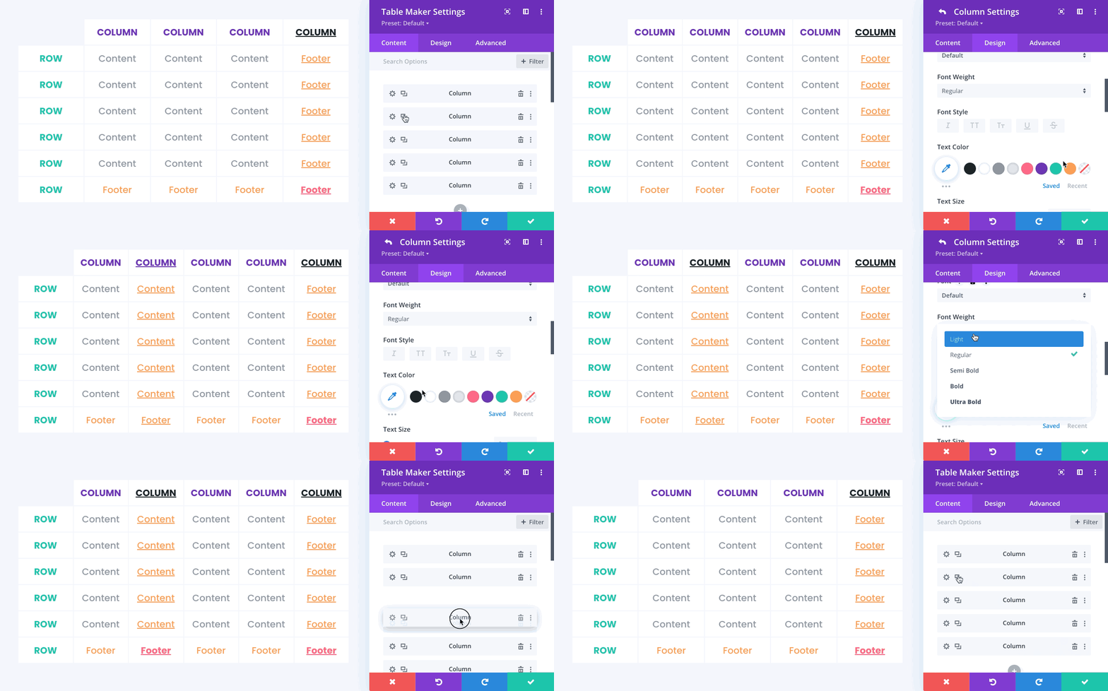
There are separate text options for table content, column headers, column footers, row headers, and row footers. Styles can be applied table-wide, per column, or individual cell.
Table Cells
Additional table cell styling options include horizontal and vertical text alignment, variable padding, borders, rounded corners, box shadows, customisable accordion toggles, and more.
To find out more, please see the Demos and download the Documentation.

