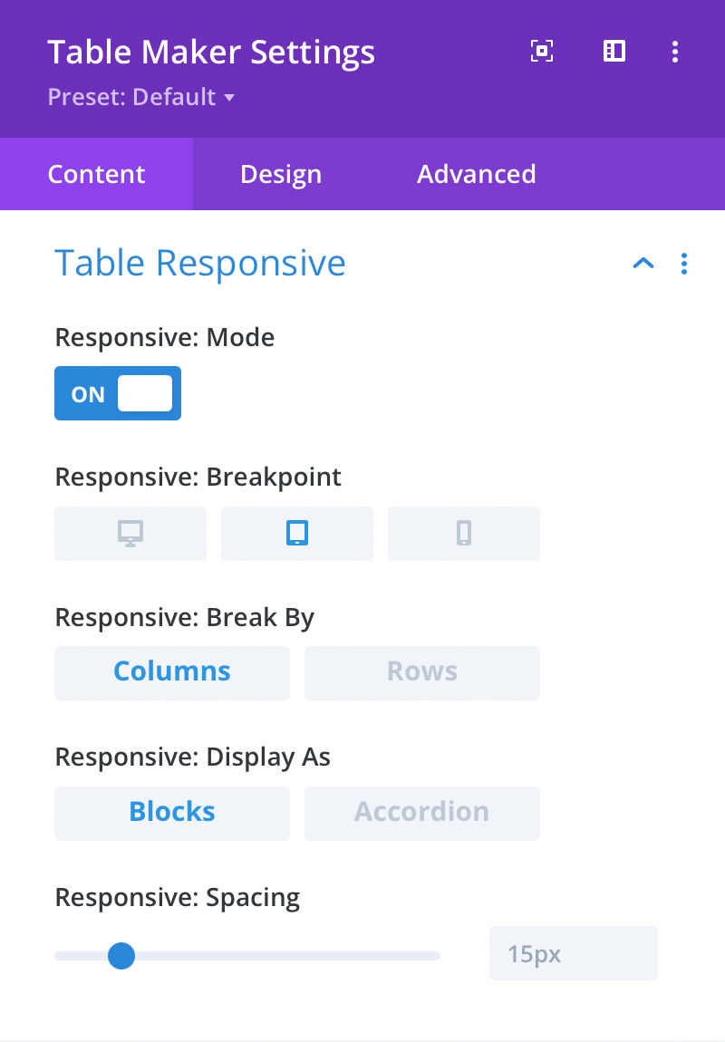
Table Responsive
Tables are great but don’t always work well on small screens. Responsive options allow you to set a breakpoint at which the table will break into separate columns or rows and display as either blocks or accordion.
Responsive: Mode
Here you can choose to enable table responsiveness. When enabled, the table will display as blocks or accordion at desktop, tablet or phone size.
Responsive: Breakpoint
Here you can set the table breakpoint. The breakpoint is the point at which the table will display as blocks or accordion.
Responsive: Break By
Here you can set whether the table will break by columns or rows. If set to Columns, each column will become a separate block or accordion section. If set to Rows, each row will become a separate block or accordion section.
Responsive: Display As
Here you can choose whether the table will display as blocks or accordion.
Responsive: Spacing
Here you can set the space between each block or accordion section.