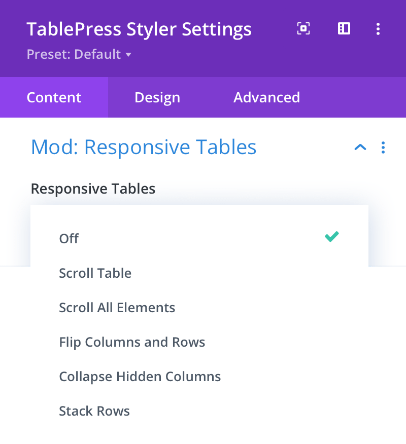
Mod: Responsive Tables
Requires: TablePress Pro or Max version 3.0.0 (or higher). See the documentation at: https://tablepress.org/modules/responsive-tables/
Responsive Tables
Here you can choose to enable one of five responsive table modes, including:
- Scroll Table
- Scroll All Elements
- Flip Columns and Rows
- Collapse Hidden Columns
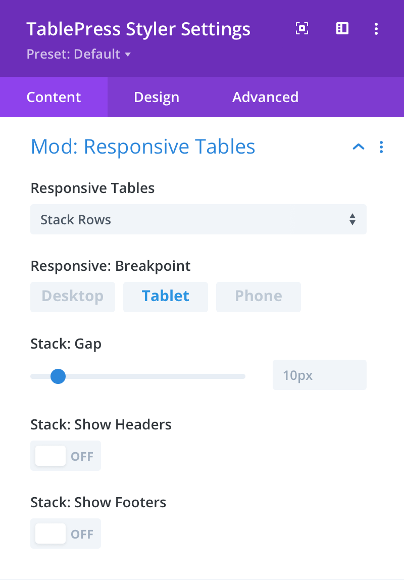
- Stack Rows
Note: Not all responsive modes work equally well for all tables. You will need to experiment with the modes to find the one that works best for your table content.
Responsive: Breakpoint
Here you can set the breakpoint at which the responsive mode will become active.
Stack: Gap
Here you can set the gap between each row stack.
Stack: Show Headers
Here you can control the visibility of table headers.
Stack: Show Footers
Here you can control the visibility of table footers.